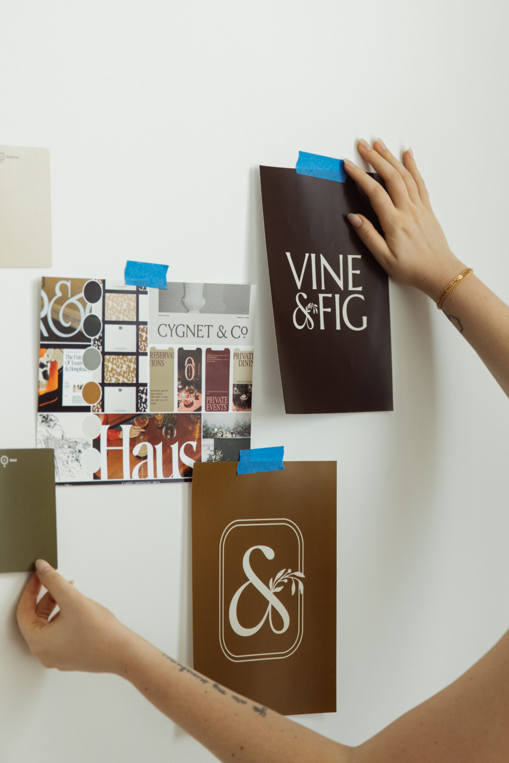
Colors spark emotions, send subconscious cues, and, most importantly, make your brand unforgettable. If you’re ready for a fresh brand identity, or fully custom brand and website, grab your favorite mug of coffee (or wine—no judgment here), and let’s dive into the fascinating world of color psychology and how to create a color palette that’s as unforgettable as your business.
What Is Color Psychology?
At its core, color psychology is the study of how colors affect human behavior and emotions. In the context of branding, it’s all about using colors to tell your story and connect with your audience.
Think about the brands you know and love: Coca-Cola’s red screams energy and excitement, while Tiffany’s iconic robin’s egg blue whispers luxury and exclusivity. These aren’t accidents—they’re masterstrokes of color psychology in action.
If you want customers to feel something when they see your brand, your color palette is where the magic happens.
The Top 3 Fundamentals of Color Theory
Before we build your killer palette, here are the top three things to know about color theory.
1. The Color Wheel Is Your New BFF
The color wheel, invented by Sir Isaac Newton (yes, the apple guy), helps us understand how colors work together. It’s divided into:
- Primary Colors: Red, blue, yellow (the OGs).
- Secondary Colors: Green, orange, purple (mix of two primaries).
- Tertiary Colors: Those fancy in-between shades (red-orange, yellow-green).
When designing your palette, think about how colors complement (opposites attract) or harmonize (analogous shades chill together).
2. Warm vs. Cool Tones
Warm tones (red, orange, yellow) exude energy, passion, and warmth, while cool tones (blue, green, purple) feel calm, soothing, and trustworthy. Balance is key: too warm, and you’re overwhelming; too cool, and you risk feeling detached.
3. Color Psychology = Emotional Superpower
Colors evoke emotions that can cue your customers into trusting your brand. For example:
- Blue: Trust, professionalism, calm (think healthcare and tech).
- Yellow: Optimism, creativity, happiness (hello, sunshine vibes).
- Green: Growth, health, stability (natural and nurturing).
Pick colors that align with the emotions you want your audience to feel.
How to Create a Color Palette That Fits Your Business
Here’s the step-by-step process to craft a color palette that perfectly represents your brand:
1. Define Your Brand Personality
Ask yourself: What’s my vibe? Are you playful and bold, or refined and elegant? Knowing this will help you choose colors that reflect your brand’s energy.
2. Understand Your Audience
What emotions do you want to evoke in your ideal customer? If you’re targeting eco-conscious millennials, earthy greens and browns might work. If you’re appealing to busy moms, soft pastels can feel calming and approachable.
3. Start with One Hero Color
Your hero color should reflect your brand’s personality and be the star of the show. It’s the color people will immediately associate with your business.
4. Choose Supporting Colors
Pick 2-4 complementary or analogous colors to create balance. These supporting colors will show up in secondary elements like your website, marketing materials, and social media graphics.
5. Add Neutral Anchors
A great palette needs neutrals to ground it. Think white, beige, gray, or even black. These make your hero and supporting colors pop without stealing the spotlight.
Why Color Matters for Customer Trust
Colors are more than just pretty—they’re powerful. Studies show that up to 90% of snap judgments about a brand are based on color alone.
Here’s how you can use color to boost customer trust:
- Consistency Is Key: Stick to your palette across all platforms. Your audience should recognize you instantly.
- Evoke Familiarity: Use colors that feel welcoming and safe. For example, blue is widely associated with reliability and trustworthiness.
- Avoid Confusion: Steer clear of colors that clash with your brand values. A financial consulting firm in neon pink? Probably not the vibe.
Ready for a Brand Glow-Up? Let’s Chat!
Creating a color palette is equal parts art and science, but when done right, it’s a game-changer for your brand. Let’s collaborate to craft a brand that wows your audience and makes your business unforgettable.
Click here to book your free intro call and let’s get started!
FAQ’s I Get About Color Palettes
1. What’s the difference between a color palette and brand colors?
A color palette is a curated collection of colors that represent your brand, while your brand colors are the specific shades you consistently use in all branding materials.
2. How many colors should my palette include?
Aim for 3-5 colors: one hero color, 2-3 supporting colors, and 1-2 neutral tones.
3. Can I use trending colors, or should I stick to timeless hues?
A mix is best! Use trending colors sparingly to keep your brand fresh while maintaining timeless elements to stay recognizable.
4. How does color accessibility factor into my palette?
Make sure your palette is legible for everyone, including those with color blindness. Use contrast-checking tools to ensure text stands out against backgrounds.
5. Why are neutral colors important in a palette?
Neutrals provide balance, letting your hero and supporting colors shine without overwhelming the design.
6. How often should I update my brand’s color palette?
It depends on your industry, but a refresh every 5-10 years keeps your brand feeling modern without losing recognition.