Before a potential customer reads a single word on your website, they’ve already felt something. That feeling either pulls them in or sends them elsewhere. And that’s not because of your logo. Or your fonts. Or your SEO headlines. It’s because of your brand color palette.
Color is one of the most powerful psychological triggers in marketing. It’s what makes your client feel safe (or excited… or inspired…) when they’re on your website or social media pages. It’s one of the parts of your brand experience that actually matters the most, in my opinion as a brand designer.
So, choosing your brand color palette shouldn’t be just choosing a few of your favorite colors, or finding a Pin on Pinterest that makes you say, “Ooh, this looks nice!” Instead, it should be rooted in strategy. And here’s exactly how to do that.
Why Color Psychology Should Be Your Brand Color Palette Guiding Light
Color psychology is where the strategy behind your brand color palette begins. It’s all about deciding how you want your customers to feel, and how your brand color palette will help you get there.
Let’s get into the basics of color psychology and how each color makes your brand feel:
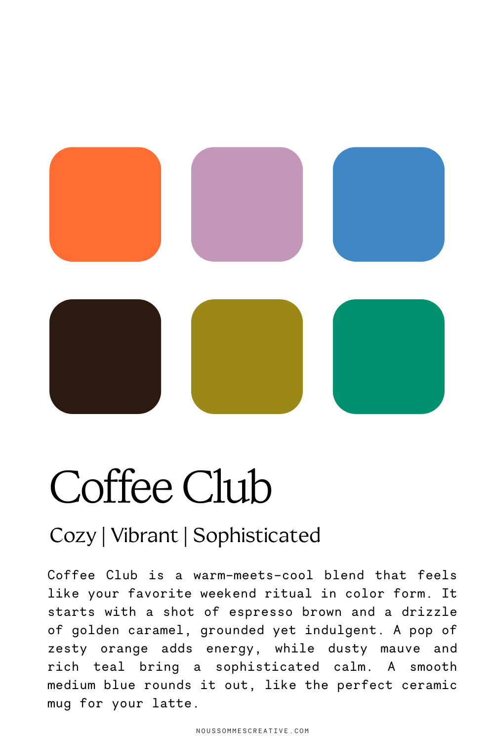
- Reds signal strength, passion, and energy
- Blues bring trust, calmness, and loyalty
- Yellows mean happiness, warmth, and high-spirits
- Greens bring freshness, growth, and grounded energy
- Oranges signal confidence and courage
- Purples give off power, luxury, and sophistication
Your colors truly can make or break your conversions. If your brand color palette is built around what makes you happy instead of what makes your dream client light up (in the way that you want them to in order to sell your product or service), you’re accidentally designing yourself out of the sale.
The Sweet Spot: Where Your Personality and Your Client’s Psychology Overlap
All that being said, don’t think your brand has to feel foreign to you. It’s not going to be a mix of colors you really, really hate. It’s just about finding that overlap where a buyer’s psychology and your personality meet. But to find that spot, you have to start with them, not you.
The first step to building your brand color palette? Understand who your dream client is. Create a persona for them, and decide how you want them to feel when they find your brand.
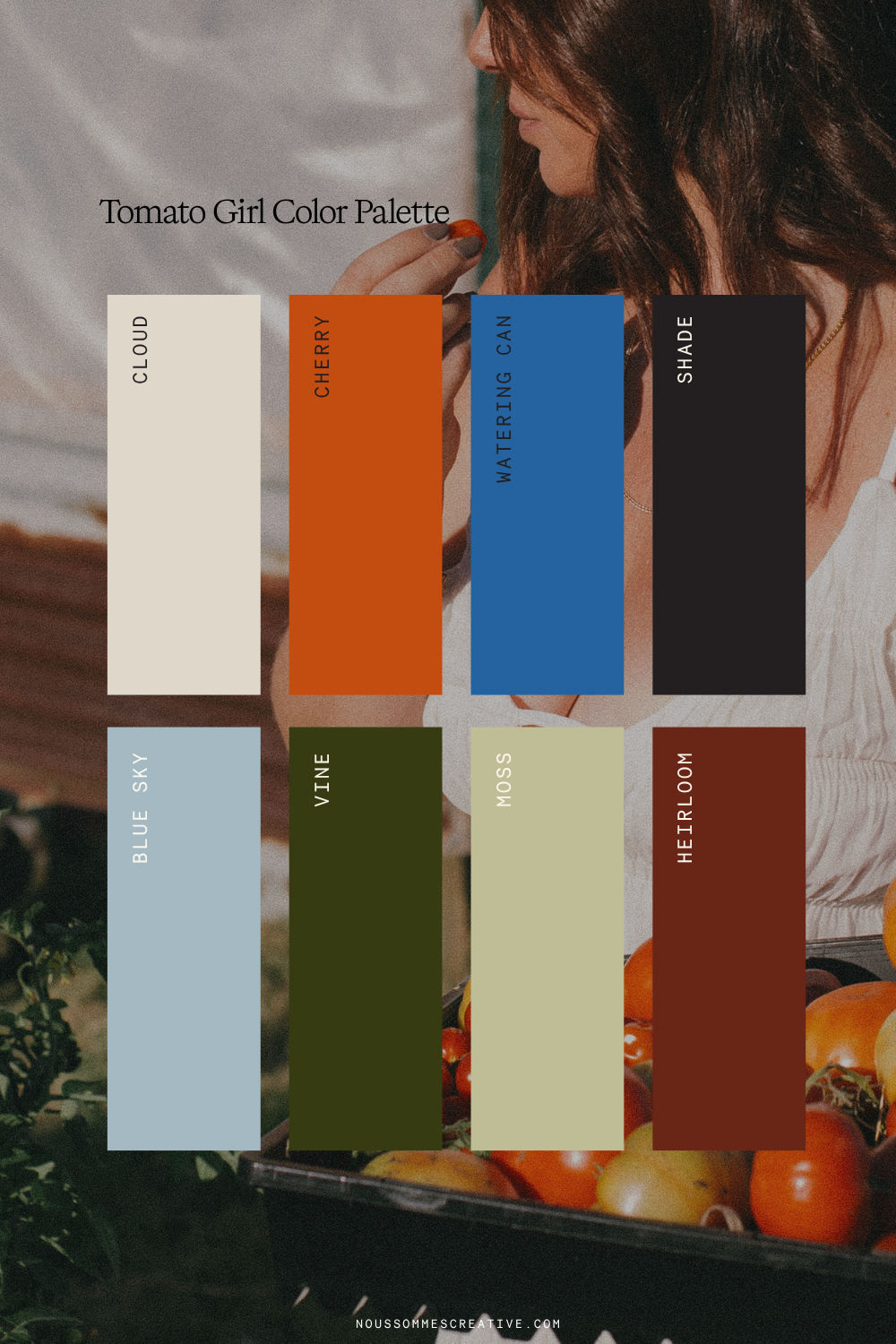
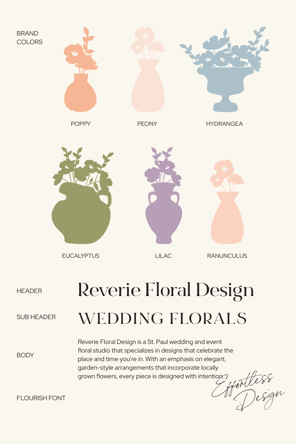
Is it a busy mom who needs calm, grounding energy in her life? A pastel color palette will call to her.
Is it an active, sporty gal, and your product is giving her strength and power? Bolder tones (and red hues) will be the way to go.
Nous Sommes Creative | Website and Brand Designer
Don’t think you have to figure this all out alone – that’s what I’m here for. I’m an expert in color psychology and building brands that not only look nice, but also really connect with your target audience.
Ready to book a vision call? Click here.